Aging T-Shirts In Six Easy Steps: Sandpaper (Part 6)
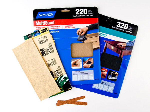
The grits keep coming.
Materials: Sand Paper (Assorted Grits), Emory Board, Pallet, A Smooth, Circular Stroke.
Method: 1. Wrap the sandpaper around a rounded object.
2. Roll the sandpaper over common stress points such as the shoulder seams and the neck, waist and arm bands in a smooth, but irregular motion (think artful, natural and restrained).
3. Apply the same treatment to the screen print or smaller, individual pieces thereof. Emory boards, it should be noted, represent one possible alternative here and make for an easier, more controlled application.
4. Repeat as necessary until desired effect is achieved.
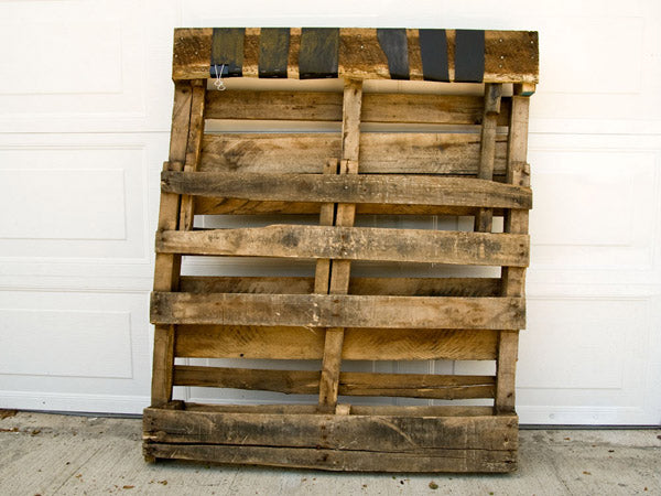
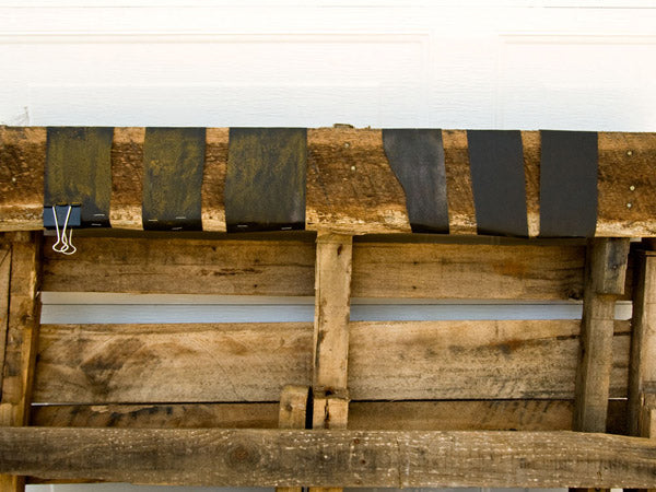
Revised Method: 1. Tack sandpaper to a fixed object with a flat surface (or, in lieu of that, something substantial and heavy that won’t tip over when rocked back and forth).
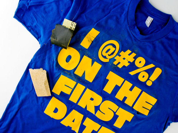
Exactly like such:
Exactly like such, but closer:
2. Pull garment taunt but take care not to misshape it or the print.
3. Floss your shirt back and forth, using the rough surface of the sandpaper to efface the print. For best results, apply very carefully to the plastisol ink; you’ll want to stop and check your progress (often!). Refrain from exposing the cotton, but if you do, use a minimum of force and apply it to common stress points such as the neck and waist hem.
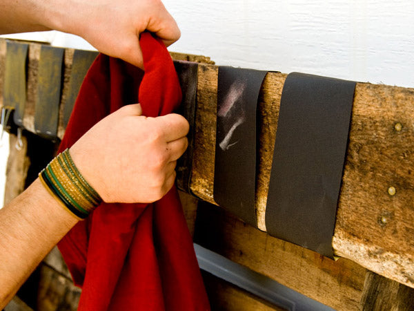
Ink dust.
&
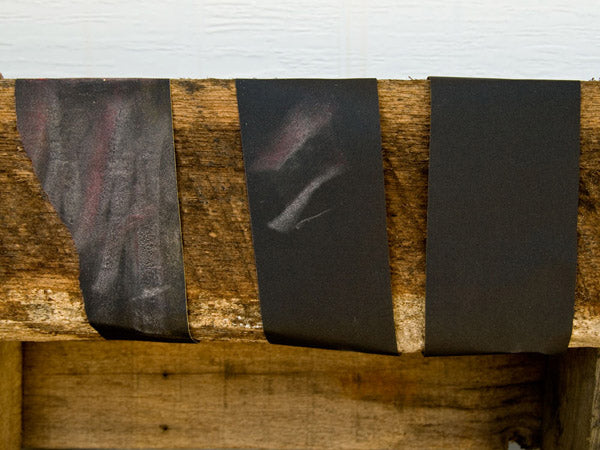
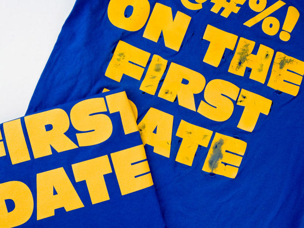
Ink Streak.
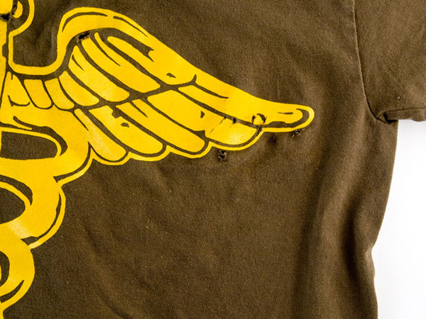
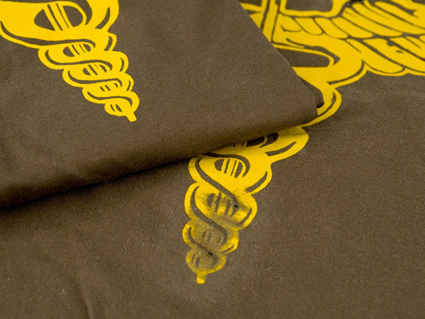
Results & Conclusions: Rougher sand papers or those with grits rated 200 or lower are overkill and will tear through the cotton in as few as 3 or 4 brush strokes; you’ll achieve better results with extra fine grades such as 320 or higher. Plastisol prints, such as the Caduceus tee pictured below, are particularly troublesome; exercise care so as not to snag or tear the fabric around the print (as demonstrated in the picture below).
Ink: plastisol.
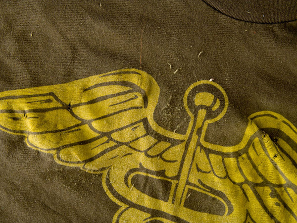
Compare with a plastisol-free variant of the Caduceus tee; look closely and you’ll notice what appear to be more natural stress marks:
Ink: water-based.
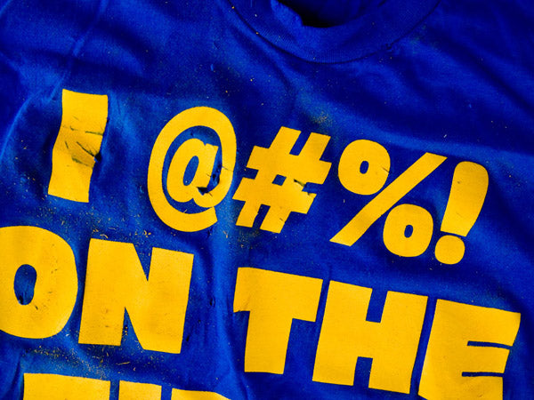
The 1st Date design, also pictured below, showcases a slightly more natural look achieved via circular brush strokes; it’s not entirely artful, but we’ve treated the top level of text, while leaving the rest as-is, so as to provide an easy and visible basis for comparison. The paint dust gives you a reasonable approximation of the elbow grease required here:
Testing Once...
Second date:
...Testing Twice.
On the rack:
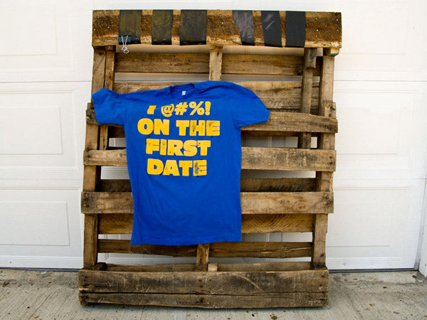
It’s impossible to pick up here in the photos but we were able to buff out (with some certainly) the top layer of plastisol which is tacky and possessed of an elevated, raised up quality. This gave the print a much softer feel, but etching through the base layer attached to the fibers with any consistency is extremely difficult as the ink tends to turn up in clumps, which does not lend itself to an aged appearance.
...Testing Twice.
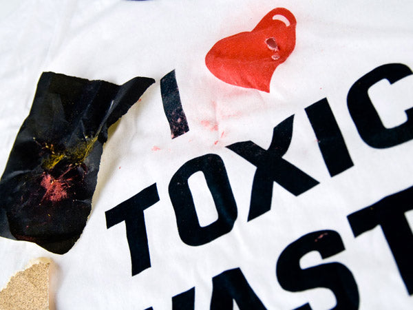
Early on, we also ran the Toxic Waste shirt through an equally abrasive — and hole-ridden — process:
Would you classify that as a launch problem or a design problem?
Ditto for Cameron’s Caduceus tee. The side by side comparison ought to give you a sense of the finesse required here.
In sum, this approach is labor intensive but also one that requires a light touch; that old adage about a little going a long way seems particularly apropos here. Ultimately, it works best in conjunction with some of the other approaches outlined earlier in this project, most notably acetone.
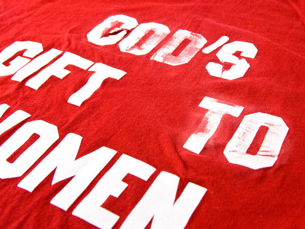
Take a look, for example, at the God’s Gift to Woman shirt below. We let the top two lines of text soak in paint thinner before running it over sandpaper. The results aren’t entirely satisfying — namely, that ungainly snag on the “G” — but they do show promise.
Next: Vinegar & Tea Soak!

